Homepage Design 101: What to Put on Your Homepage?
Nowadays, website design is no longer limited to information. A website that is beautiful and contains information that responds to the needs that Internet users search for can keep them from staying on your site longer, it may even prompt them to view other pages and be interested in the product or your business’s service more.
You want your website to look professional and relevant, must be easy to use, you want it can be found on google by optimizing search engines. You want to convert page visitors into your customers. The question is how to do it? More importantly, how is that right?
This Homepage Design 101 article will talk about the processes and steps in turn to help you save time during work.
The Importance of Homepage
The home page of a website is the opening page, usually located at your main website URL. The homepage may not be where people start, but it is where they go when they need to navigate quickly or when they return to your site later. Its goals are usually to:
- Increase Brand Awareness: If you make your website memorable, then it will be that much easier to generate returning visitors and brand buzz. Your brand image and values should be obvious through the messaging of every page on your site, especially the homepage.
- Help them realize they’re in the right place: The homepage is the door to the rest of your site and everything that will inform your visitors on your value, offers, products, and background. Without it, no one will be able to identify who you are or why you own your position in the market.
- Boost Conversation with visitors: If you make it easier for them to get what they need on or through your homepage, then you’ll have a much easier time boosting your conversion numbers.
Home pages can be long or short, containing a lot of information or just a little, depending on your goals. A well-built homepage usually translates into an easy interface that visitors have no sweat navigating. By providing access to the information that they’re looking for in an organized fashion, you’re providing them with value right out the gate.
Layout of Your Homepage
With the explosion of digital, people are becoming more and more demanding (and impatient) nowadays. Your visitors will make a very simple, split-second choice when they arrive on your home page – stay or leave. How you choose to lay out your home page will affect that decision — and will impact the fate of your business.
Simplistically, the layout of your home page is divided into two parts:
- Above-The-Fold – content you can see WITHOUT scrolling down when your home page is first loaded. 100% of your visitors will see the content Above-The-Fold, as it is displayed on their computer screen right away.
- Below-The-Fold – content you only see when you scroll down. As you scroll down the page, the number of people who will continue to pay attention to your content will drop. This is why it’s so important to plan what content your place Above-The-Fold and Below-The-Fold.
Elements to put above-the-fold
#1. Headline – Your Value Proposition
In one single sentence (two at the most), you must answer the question that all your visitors will be asking – “What does your company do? Who does your company do for”, in other word, provide your value proposition.
A good headline will answer this burning question — so it needs to short, clear and describe what you do perfectly. These are somethings you have to notice when creating a headline:
- Write for the visitors. Some headlines are self-serving. Some answer the question “What’s in it for me?” You can probably guess which are more compelling.
- Be clear. Picking up on a common theme here? After scratching their heads, the next thing confused visitors reach for is the back button.
- Think about click-through continuity. Your homepage headline should offer continuity to the medium and message that lead visitors there.
If you don’t know what to write, try asking your customers or audience why they visit your website, use your services or products. You can take literally take the words right out of their mouths and use them as your headline. Or you should hire a professional copywriter to write your homepage headline (as well as the rest of its copy). Cutting corners with your copy won’t save you money; it’ll have the opposite effect.
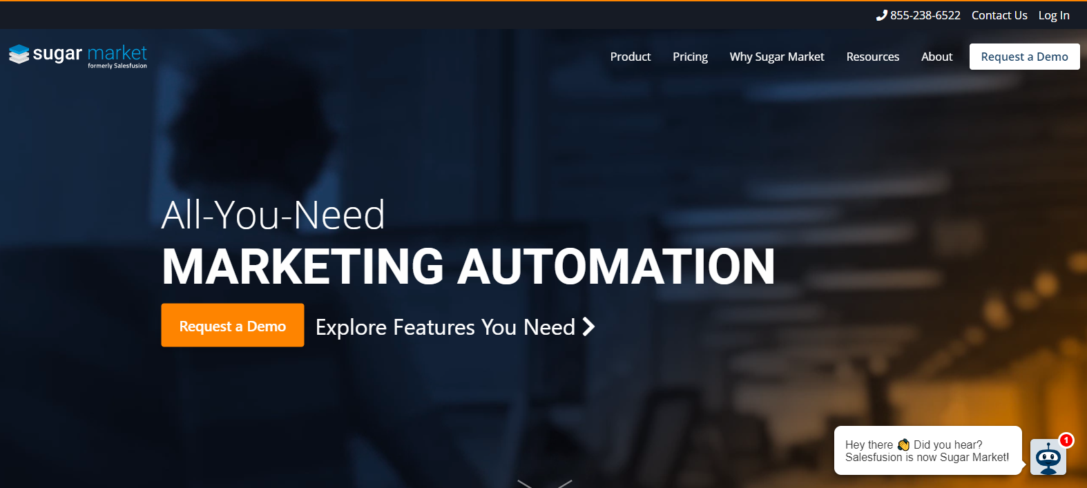
Take SaleFusion’s Homepage for example. They called themselves as All-You-Need for Marketing Automation. It gets the message across perfectly and tells them what they are doing with a fancy way.
#2. Sub-Headline
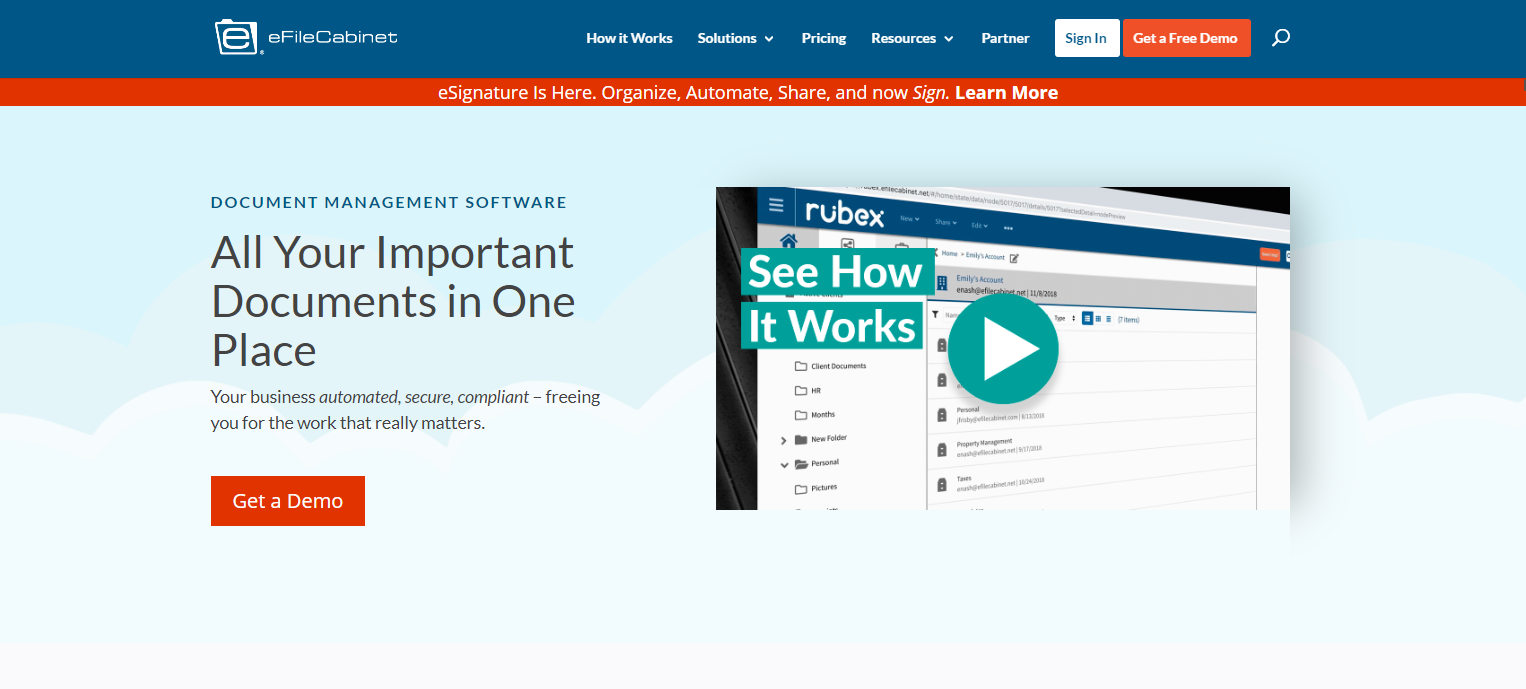
This is where you define your service/product in a bit more details with your sub-headline. The brief description should answer – “What problems do you solve for me?” In one short phrase, it tells you how their product can help you.
Here is good example of an effective sub-headline. In this example, their users can use their product to improve their business!
#4. Logo
The first thing your visitors can see is your company’s logo. Place it on the top left. Logos are a tool to position your business in a consumer landscape that is increasingly visual. Logos become the face of your brand identity, so it’s essential to be professional and consistent in your image.
A website logo is partially part of the header. Having a logo makes it easy for visitors to identify your website, even with a glance, especially if there are multiple tabs opened. A logo is at the core of your company’s branding and identity. For those who are familiar with your website, your logo becomes a signal that they have arrived at the right place. On a website, the logo doubles its functionality as a link to the homepage. It functions as a home button, which takes visitors back to the homepage with one click.
#5. Eye-catching imagery: Use Images or a video to illustrate your message
What you need to ensure is that your images play a solid role on your site and don’t just improve its visual quotient. Meaning, don’t add photos just to add photos.
But sometimes website owners forget that adding supporting images help get your message across quickly but to choose them judiciously. Since images capture emotions and can inspire action, the right photo can make or break your homepage.
What media could we include?
- Featured images appearing as a thumbnail image that accompanies a blog post title that is pulled into your homepage.
- Images like icons or illustrations that quickly highlight service features and benefits.
- A 30-second video highlighting the company’s uniqueness or culture.
- Banner photos that reflect your target market.
- A visual hook to replace text. Sometimes text is helpful but going through text-heavy content isn’t very enjoyable. What if the text was replaced with images? These pages hook visitors as nothing else can.
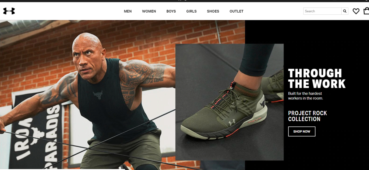
For example, Under Amour built their homepage with lots of catching images and videos.
#5. Primary Call to Action
Make sure your call to action located above the fold — the top part of your homepage that’s visible without scrolling. With a clear, short, hard to miss, your call to action can lead visitors to make a purchase. A Primary Call to Action helps you determine the website’s ROI.
The main goal of a homepage is to compel visitors to do something on your website. It doesn’t matter, every site needs a primary call to action. The user should understand immediately where to click because your call to action button should stand out from the surrounding design. The longer it takes a user to find the call to action, the more likely they are to become confused or click away.
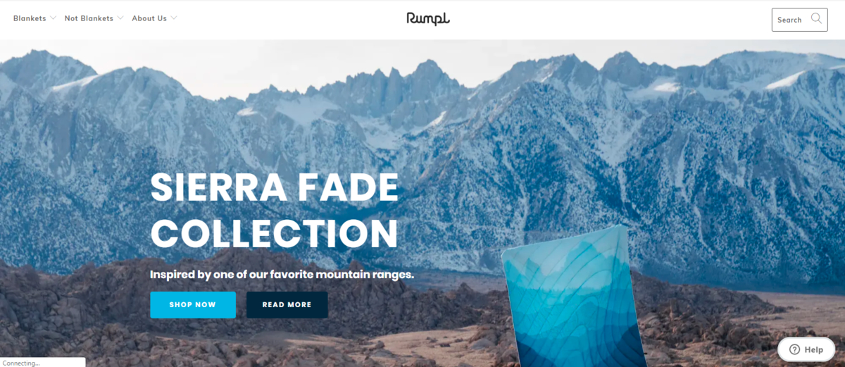
Rumpl, an online store selling specialty blankets, highlights their featured product above the fold with a call to action: “Shop now” and “Read more”.
#6. Navigation Bar
A clear navigation bar allowing visitors to quickly navigate to the sections that interest them. It will take longer for visitors to find the other key pages on your site. The navigational strength of a web page rests on its simplicity. This may seem contradictory when you want to accommodate different types of visitors, but it makes sense when you consider how quickly people move from page to page on the internet.
Users who complete a search are more likely to convert. If your brand is selling a lot of products, an easy-to-find search bar offers an alternative to complex navigation that’s likely to turn customers away. Users will know what’s important and where they can go to get the specific information they need.
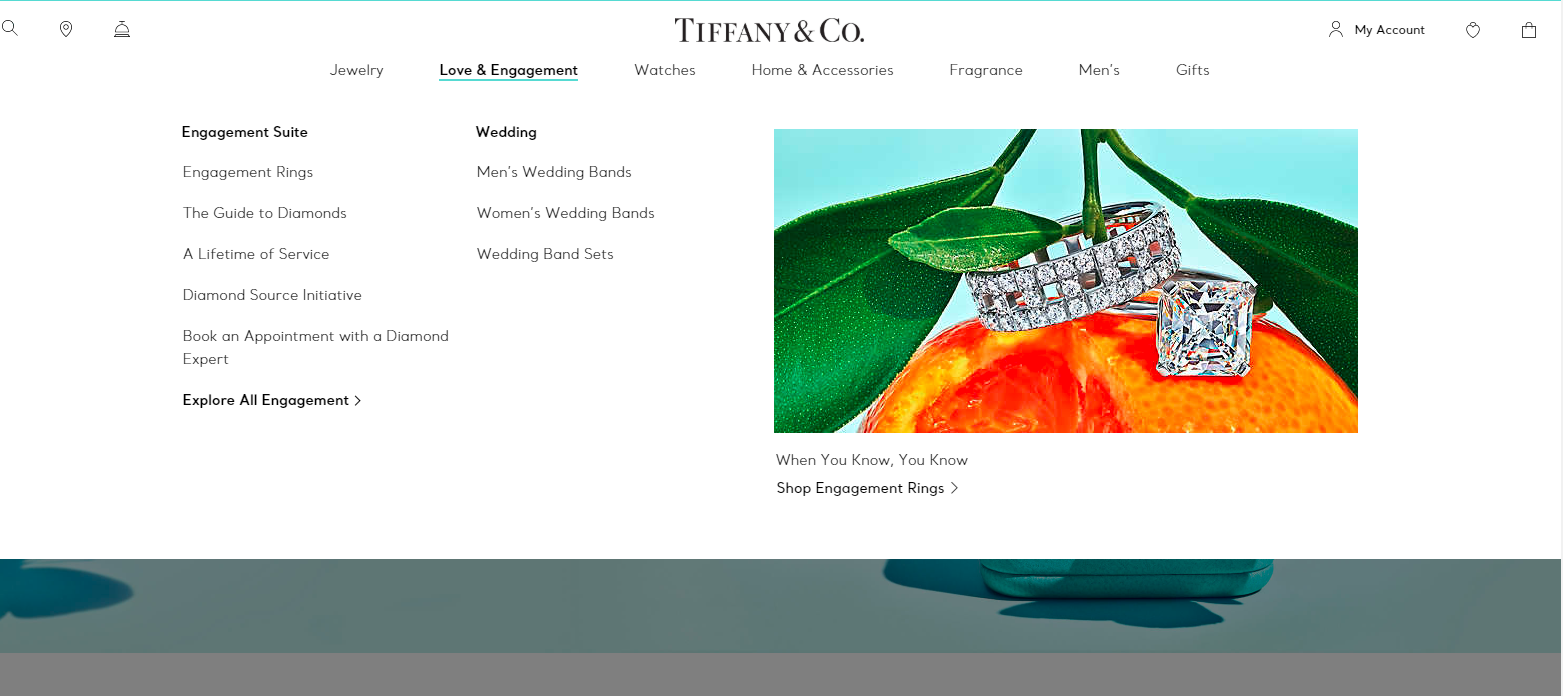
Tiffany & Co., for example, has an extensive collection of different products. To make it easier for their customers to find what they’re looking for, this company has added a navigation bar that help visitor’s search query with right products, collections, and pages. This creates a direct path to the page that the user is looking for from the homepage.
Elements to put below-the-fold
Elements that you feature below the fold (i.e. after users scroll) aren’t necessarily less important—they often reinforce and expand on the information you’ve already introduced, provide other paths to the same conversion goal, and make other pages available to the customers who need them.
#1. Feature highlights
List out your most compelling features that your visitors will want to have. Feature highlights helps your potential customers know what exactly they are getting when they make a purchase.
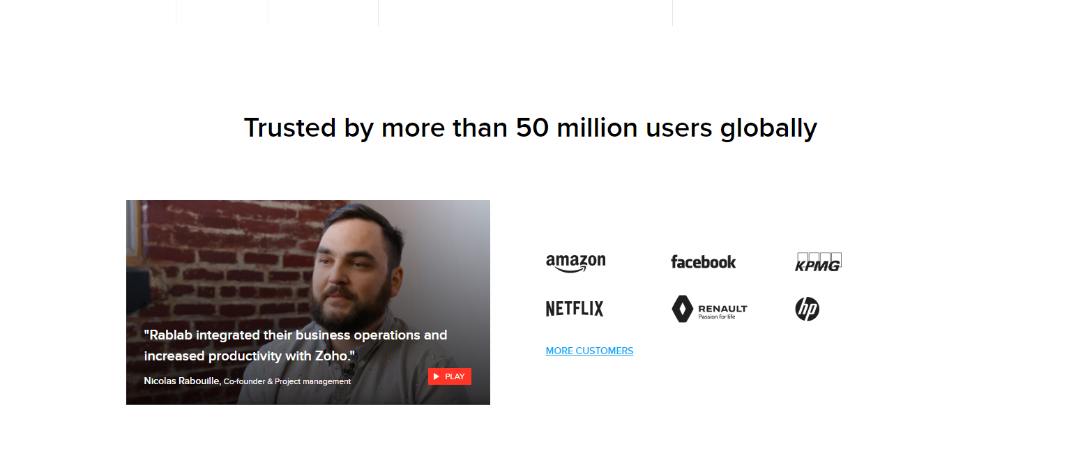
#2. Proof: Customer reviews, endorsements, and press
This proof can be customer success stories, customer testimonials or quotes, professional accreditation (industry association affiliations, Better Business Bureau score), media quotes, the number of social network shares, and display personalized blurbs about your team members to create trust. So, by showing other people like you and your brand, you can boost your credibility and trustworthiness.
Zoho demonstrates proof with a number of powerful customer logos and a preview of a compelling case study.
#3. Your own contents: Blogs, videos, and other content
Apart from using your homepage as a landing page that attracts and converts leads, you can vary slightly and create an educational tool. Google is looking for specific cues. If you are sharing your information and becoming a leader in your industry, sharing your content can ensure your status as an expert.
Unlike other standard websites, prospects would have to click on the “blog” or “services” categories to find more information about what they were looking for. However, you can include highlights of your blog posts, short videos, or 3-D animations on the homepage. You can showcase recent posts with their headlines, featured images, or descriptions followed by the “read more…” caption. .

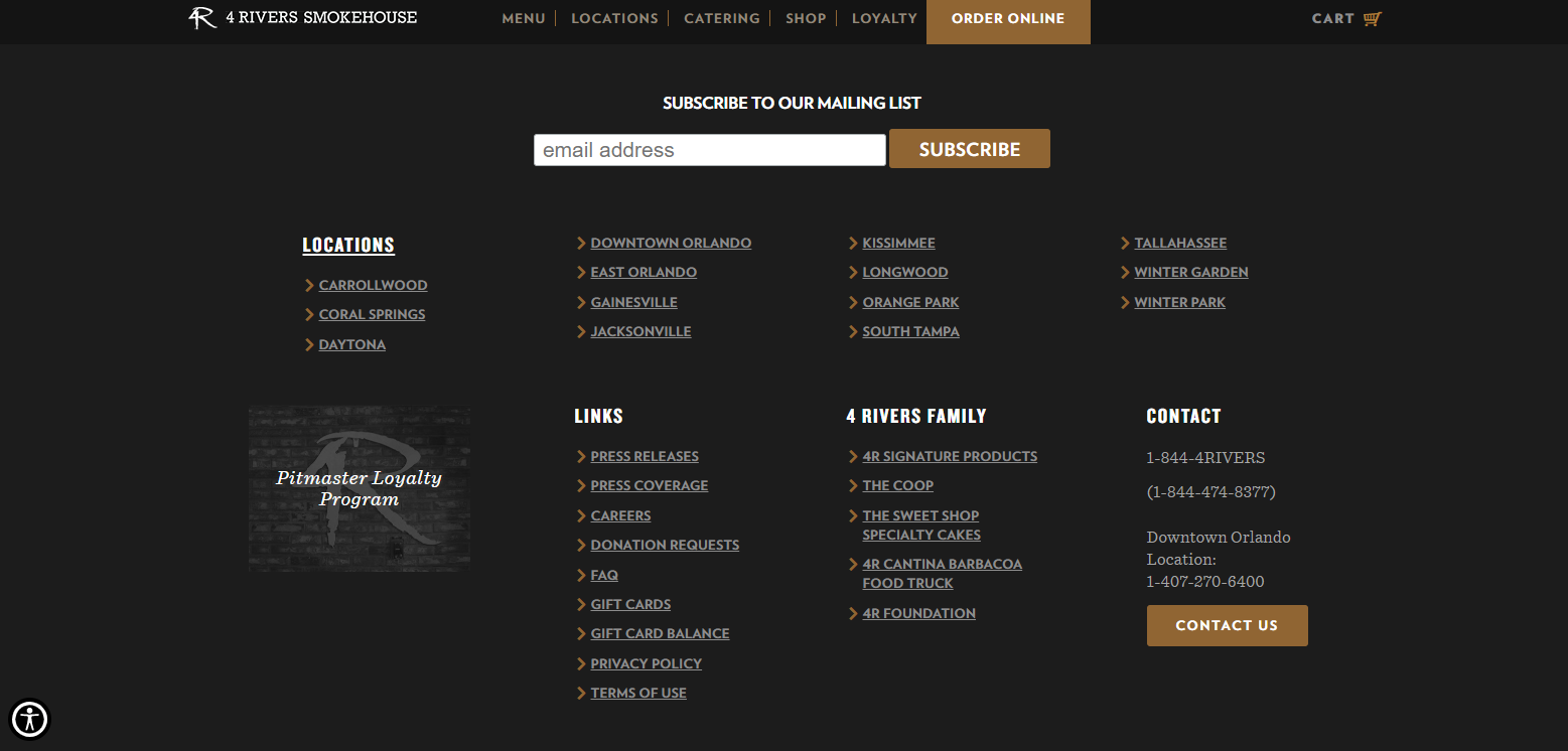
#4. Footer
Finishing off with an informational footer is of importance, just as the header. Once the visitor gets to the end of your homepage, they should be greeted with three items; contact information, social media integrated links and links. Contact information encourages the website visitor to get in touch with you. Social media integrated links is the best way to convince visitors to check your social media pages and possibly engage with the company on other platforms. Besides, it adds to the company’s social proof, especially if the visitor clicks on your social profiles.
The Bottom Lines
If the above list makes you think that improving your website homepage means adding more elements, that’s not necessarily the case. Each new item you add could distract from your main message and call to action. Also, it can leave a bad impression on your visitors.
You’ve just read about website homepage design ideas. You should discover around to find some ideas on how to make your website homepage more effective.
Your website homepage should never just be a decorative part of your marketing strategy. Instead, it should play an active role in bringing in sales and repeating your branding message to potential customers. Clearly, the content written as above mentioned a lot about the interests and interests of customers. Thus, in order for marketing communications in general and website content development, in particular, to be most effective and effective, businesses need to put customers at the forefront.
If your website homepage doesn’t seem to be delivering on that promise, work on some of the recommended changes above. You can start with the ones that are the easiest for you to implement. By making these simple changes, your website homepage might even become one of your most important customer acquisition channels